 |
| Handwritten Menu 1905 |
My grandmother used to collect unusual menus from restaurants - she was extremely charming and people couldn't say no when she asked to take one home. She had a small collection as menus are not really that unusual most of the time. I laughed the first time she came home with one - she was so proud that she was able to persuade the waiter to give her the menu. We sat over it and discussed all the items on it, some were in French so we tried to figure out what they were and we even tried to re-cook some of the dishes at home.
Her collection was small because restaurants have normally just simple menus, especially if they change the items on the list. I have recently an article about the
science behind written menus and it states that menus should be only one page long, prices only be displayed without the currency sign (kinda agree) and that it should be not be sorted by price but after a chart that has been developed according to how we screen a menu when reading.
 |
| Creative modern menu |
|
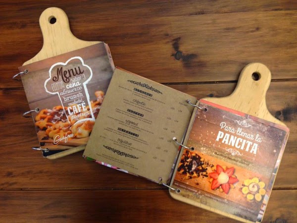
I always say to chefs, keep the menu simple - the items at least. But what about the design of a menu? Are we really happy with just a page, printed and maybe a little picture on it? Or would we prefer a creative design?? I for example hate laminated menus - it looks cheap and most of the times it is sticky and dirty (funny as it was laminated to keep the paper beneath clean). Don't get me wrong, I am talking about the design not the food.
 |
| Printed Menu |
So what should be on a menu? Of course, the food, the prices, now also allergies like nuts etc. (a complete list can be found
here) and some are now displaying calories (which I don't agree with at all to be honest). These are the fundamental items that need to be on the menu (doesn't make much sense having a menu otherwise now, does it) but the second one is the design of the menu itself. Font, size, colour etc are decisions that most people don't pay much attention to - unfortunately if you ask me.

By researching vintage style menus I came across some beautiful samples - some handwritten ones, some painted and some even so simple, still gorgeous. The Workshop Tea Room in Ballygarvan had a wonderful example from the Cork Airport Restaurant about 50 years old and it looked simply stunning.
So, back to the question, why are modern menus so boring?? Obvious, it can be expensive if you are changing your menu regularly (let's face it, menus should be changed any now and then) and having to reprint it but there are many ideas on how to create a beautiful one. Craft shops are a great place for inspiration, look at vintage samples or simply leave your imagination run wild. Hey, there could be even a new business in for the right person - designing beautiful menus.


 By researching vintage style menus I came across some beautiful samples - some handwritten ones, some painted and some even so simple, still gorgeous. The Workshop Tea Room in Ballygarvan had a wonderful example from the Cork Airport Restaurant about 50 years old and it looked simply stunning.
This comment has been removed by a blog administrator.
ReplyDeleteThanks for posting nice blog. Print Laminated Menus From PrintMagic that have an edge over regular paper menus of being more durable and withstanding frequent use. It also protects against spills, stains, wrinkles, smudges, tears, and other contaminants and can be easily cleaned with water and even sanitized prior to each reuse. As these are reusable and last long savings the cost of reprinting frequently.
ReplyDelete